Ever wonder about the journey your visitors take before they exit your website? With Google Analytics user flow reports, you can learn about the path visitors take before reaching their destination.
By analyzing behavior flow, you can better understand the path visitors take on your site, highlight pages where a lot of users may be leaving your site, and better understand what you can do to improve the overall user experience.
So, in this article, we’ll break down Google Analytics user flow, what it is in GA4, how you can find your behavior flow report, and how to conduct a user flow analysis.
- What Is the User Flow Report in GA4?
- Tutorial: User Flow in Google Analytics 4
- Google Analytics Behavior Flow FAQ
What Is the User Flow Report in GA4?
The Google Analytics user flow report is now called the Path Exploration Report in GA4. It’s a visualization of the path users take through your website. It helps you see users’ behavior across your site by highlighting traffic through different events and pages.
That way, you can better understand how visitors interact with your website and find opportunities where you can improve the user experience.
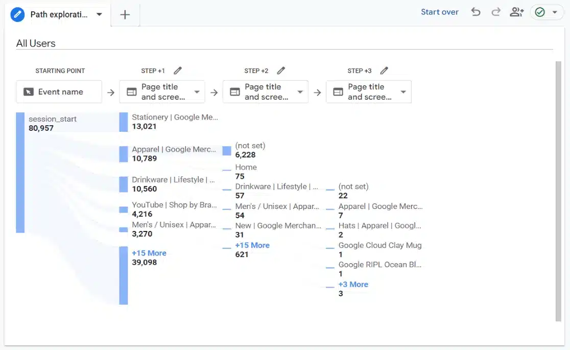
With Google Analytics 4 user flow, you can see:
- See your through traffic to other pages.
- Understand how users are likely to behave when they’re on certain pages.
- Discover looping behavior where users may be getting stuck and hitting the back button.
- And more…
For instance, let’s say you have a lead-capture landing page, you can analyze behavior flow in GA4 to see the journey visitors take to arrive on that page, whether they perform an event, where they go next, and more.
So, ready to learn how to track user journeys in Google Analytics and set up your own path exploration report?
Tutorial: User Flow in Google Analytics 4
Now that you know what Google Analytics user flow is and why it’s important, let’s see how to track user flow in GA4 and use the path exploration report to conduct a behavior flow analysis.
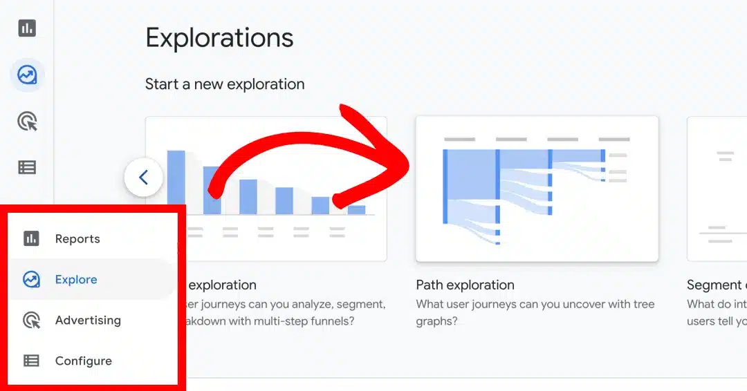
To start, log in to your Google Analytics account and select the website (property) that you want to see behavior flow for. Then, navigate to the Explore tab from the options on your left and click the Path exploration template.
After clicking the template, you’ll see a default path exploration that Google Analytics creates for you. It’ll look similar to this:
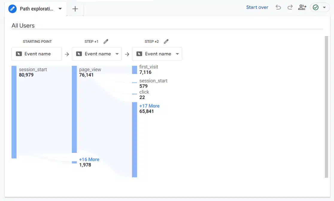
By default, Google Analytics 4 uses events as the user flow steps when you create a new path exploration, which can look confusing at first. But don’t worry, we’ll show you how to change it to display the behavior flow data you want.
Look at How Users Flow from Page to Page
First, we’ll show you how to see the pages visitors move between to get an idea of where they’re likely to go next from certain pages. Click the dropdown under Step +1 on the report and change it to one of the Page title options.
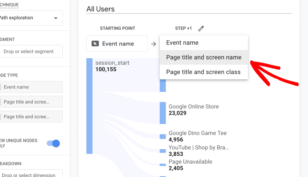
Now, click on one of the pages listed to see where visitors went next. If you want to see the user flow for a specific page, you can use the Pencil icon next to the step and check which pages to include in the flow.
When you click any page on the report, a new step will open that shows the pages users visited after that one.
For example, we clicked the page titled Drinkware in Step 1. Now, we can see that Apparel is the page visitors most often go to next. You can scroll over any page to see how many events took place on it.
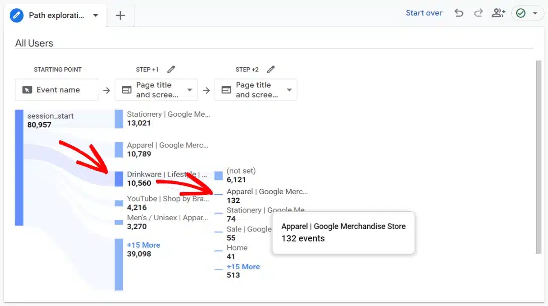
This can help you predict how users will move through your content and spot issues in looping behavior. Using the example above, if we saw that a lot of users moved from Drinkware to Apparel and then back to Drinkware, that might signal that visitors are getting stuck on the Apparel page or not finding what they want.
If you want to see which pages cause your users to exit, check out our tutorial on How to Find Exit Pages in Google Analytics.
See Behavior Flow Related to an Event
If you want to see user behavior before or after an event, just use the drop-down menu to change that step to Event name. For example, the report below shows the user journey after visitors view a promotion.
After the session_start, most users are on the Home page. In step 2, we see how many view_promotion events take place on that page. From there, most users have remained on the Home page, so we use step 4 to see the pages they go to next.
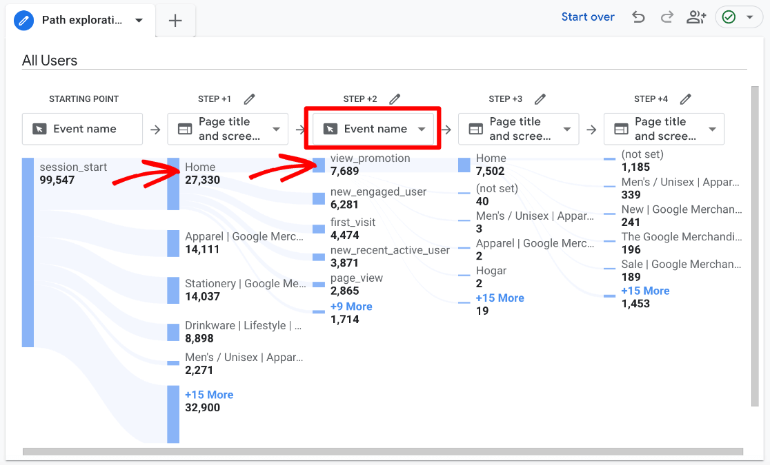
Remember, you can also click the Pencil icon next to any step to edit what’s included in the report. For example, we could exclude certain events from being shown in the flow. Or, you could change the first step to first_visit events to get a better look at new visitors’ journeys.
Add a Dimension to Breakdown User Flow
Next, you can add a dimension to see the journey of your audience broken down by different variables. Use the two columns to the left of the report to add dimensions or filters.
For instance, after setting up a user journey, you could add Device Category as a dimension under Breakdown. Then, just click one of the device types that’s shown below the report to see how the user flow changes for different devices.
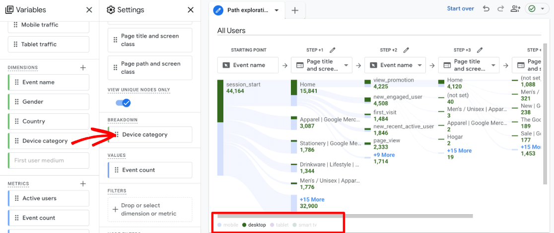
This can be helpful for spotting problem areas like if mobile users are looping at a certain point, but desktop users aren’t.
You can also hover over specific pages or events in the flow report to see a breakdown of the number of events by the added dimension (device category in our case).
Another helpful breakdown to look at is how the Google Analytics user flow changes depending on the pages visitors first land on. To add this dimension, click the + sign next to where it says Dimensions under the Variables column. Search for and Import the dimension called Landing page + query string. Then, change the Breakdown box (under the Settings column) to that dimension.
By seeing how users flow depending on the page they arrive on, you can spot pages that are leading visitors down a desired path and ones that aren’t. Then, analyze why this is happening and how you can improve the user experience and optimize the path to lead to a conversion.
You can import any dimension that’s available and add it as your breakdown to get an in-depth behavior analysis using different variables.
Add a Segment to Narrow Down User Flow
Your Google Analytics user flow reports will display all users by default, but you can add segments in the path exploration to view the behavior flow of different audiences.
Depending on your use of Google Analytics, you may already have some created segments. If so, you’ll see them in the Segments section under the Variables column. To add a new segment just click the + sign. You can create a custom segment, use a pre-built one, or customize one of the available templates.
Just drag the segment you want to use into the Segment box under the Settings column.
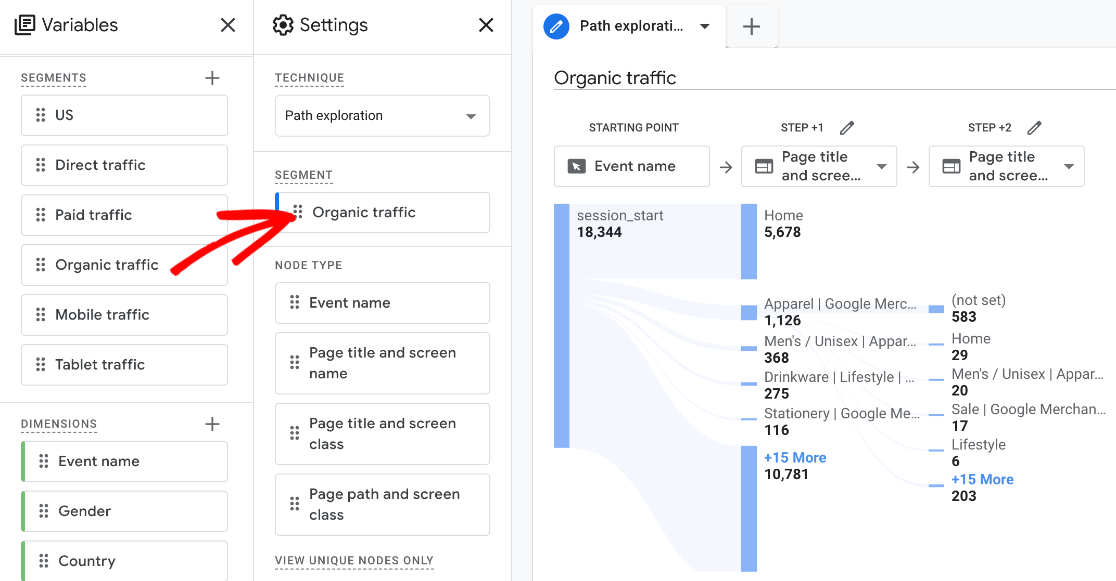
Now you’re viewing the GA4 behavior flow report for users in that segment. In the above example, we used Google’s segment template called Acquisition and filtered first user medium to Organic. So, the report now shows the path of visitors who originally came from organic traffic sources.
You can create segments to gain all kinds of additional insights like how traffic from referral sources interacts on your site, how new vs. returning visitors flow from page to page, how audiences from different countries behave, how visitor demographics, like age, affect user flow, and more.
Go ahead a play around with using path exploration and creating Google Analytics user flow reports to get used to how it works and what you can do. You can create more path explorations and use a combination of the techniques we’ve gone over to really dig deep into the visitor journey.
Congrats! You learned how to use Google Analytics 4 user flow reports and perform behavior analysis for your website.
Google Analytics Behavior Flow FAQ
What is GA4 path exploration?
Path exploration in GA4 allows you to see how visitors navigate your site. It’s similar to the Google Analytics user flow report from Universal Analytics. You can see where users go next after viewing a certain page, which events take place, where visitors move to after certain events, how different audience segments behave, and more.
Do you have an eCommerce site? With the ExactMetrics User Journey report, you can see every step in the customer journey to purchase right inside WordPress.
Where is the path exploration page in GA4?
You can find path explorations by clicking the Explore tab in the left navigation of Google Analytics. To access any of the path explorations you’ve already created, just scroll down on this page until you find the one you want. To create a new path exploration, click the Path exploration template under Start a new exploration.
Is there reverse path exploration in GA4?
Yes, to create a reverse path exploration, click Start over in the top right of a new path exploration report and select an Ending Point, which can be any event such as view_cart or a specific page like a product landing page. Then, just use the path exploration like you usually would to create a Google Analytics user flow report. It will display the user flow in reverse from the endpoint you selected.
What is the difference between funnel and path exploration?
Path exploration is an open-ended visualization of how users flow through your site. On the other hand, funnels have one predefined path that brings users to an end goal or conversion. A funnel shows each step in the path and how many users are abandoning at each step, but a path exploration shows how users flow organically.
If you have an eCommerce site, be sure to check out ExactMetrics’ funnel report!
How would you analyze the conversion paths?
Although the GA4 path exploration can kind of show the user flow to conversions, there’s a better report for analyzing conversion paths. Go to the Advertising tab in Google Analytics and then click Attribution » Conversion paths. This is the report you’ll want to use for conversion path analysis. Check out our tutorial on the Google Analytics conversion path report to learn more.
What is the difference between behavior flow and user flow in Google Analytics?
In the previous version of Google Analytics, the Behavior Flow report was used to see how visitors moved through your website from one page or event to the next and analyze user engagement on content. The User Flow report was a visual representation of traffic flow that could show where users exited and how traffic from different channels flowed.
The Path Exploration report in Google Analytics 4 somewhat combines user flow and behavior flow, allowing you to see open-ended paths by pages or events, break down paths by traffic channel or other dimensions, and more.
And that’s all, folks!
By understanding how people behave, interact, and move through your website, you can better understand your audience, find areas to optimize, and provide a better user experience.
We hope you enjoyed our article on how to use the Google Analytics user flow report in GA4. You can also check out our post on How to Track Google Analytics Custom Events.
Not using ExactMetrics yet? What are you waiting for?
Don’t forget to follow us on Twitter and Facebook to see all the latest reviews, tips, and Google Analytics tutorials.

